Skyview
I worked as the designer for Skyview’s brand renewal, a helicopter sightseeing tour service in Japan. My role focused on creating a new logo, defining the color palette, and designing key promotional materials to refresh and unify the brand identity.
Branding

Problem
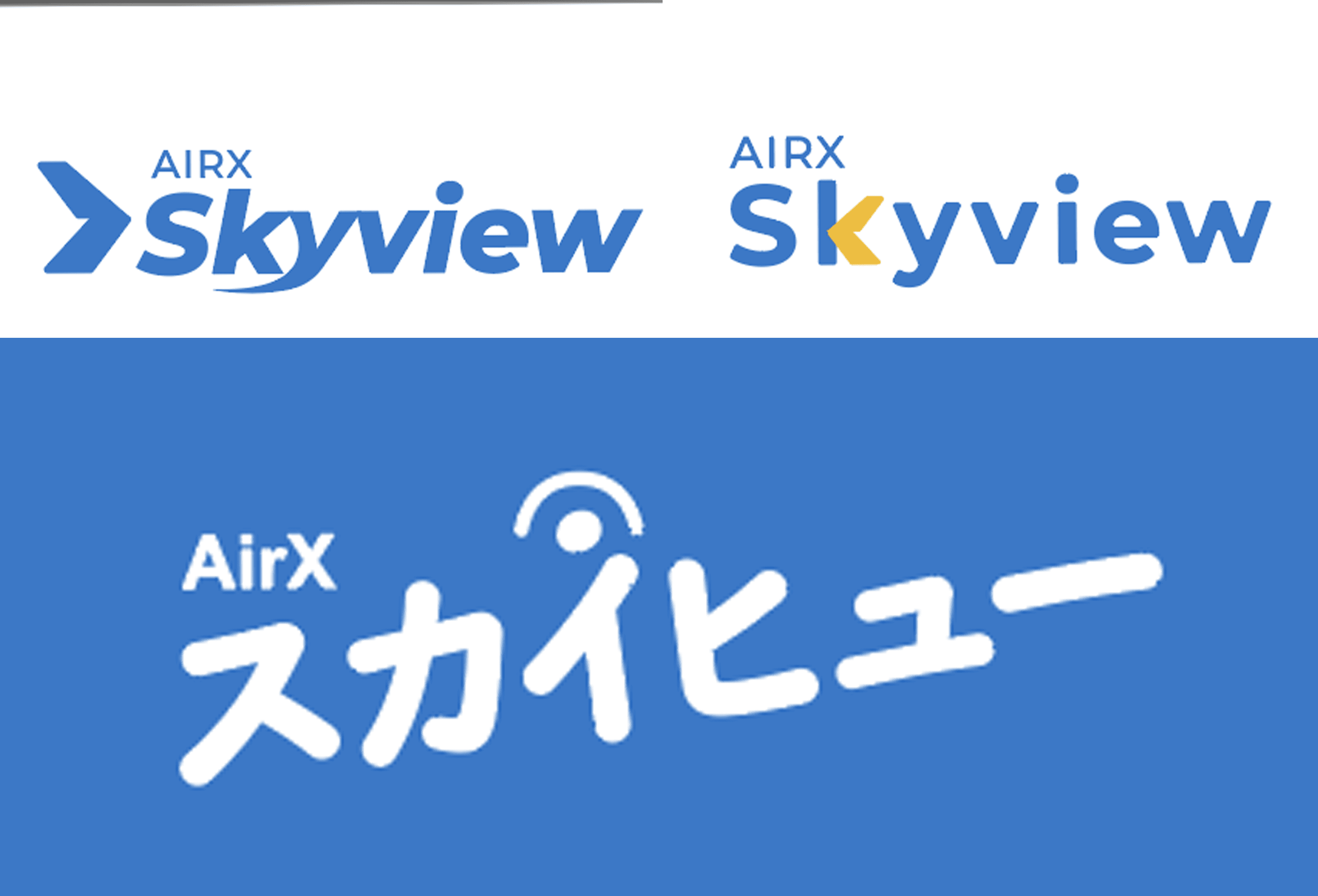
The old logo did not clearly represent Skyview’s helicopter sightseeing service and felt too stiff and business-oriented. The brand needed to express more fun, enjoyment and friendliness to better reflect the experience it offers.
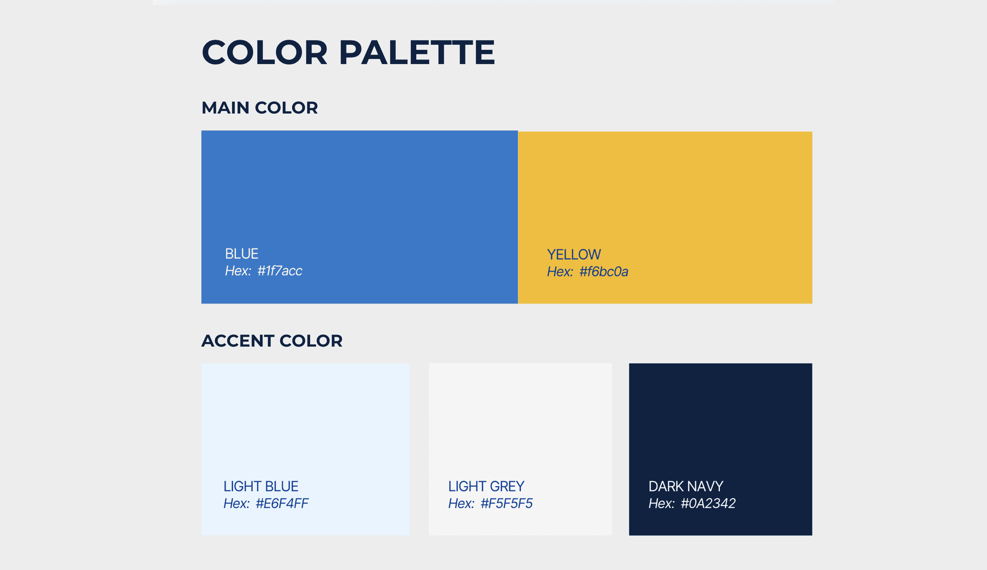
Solution
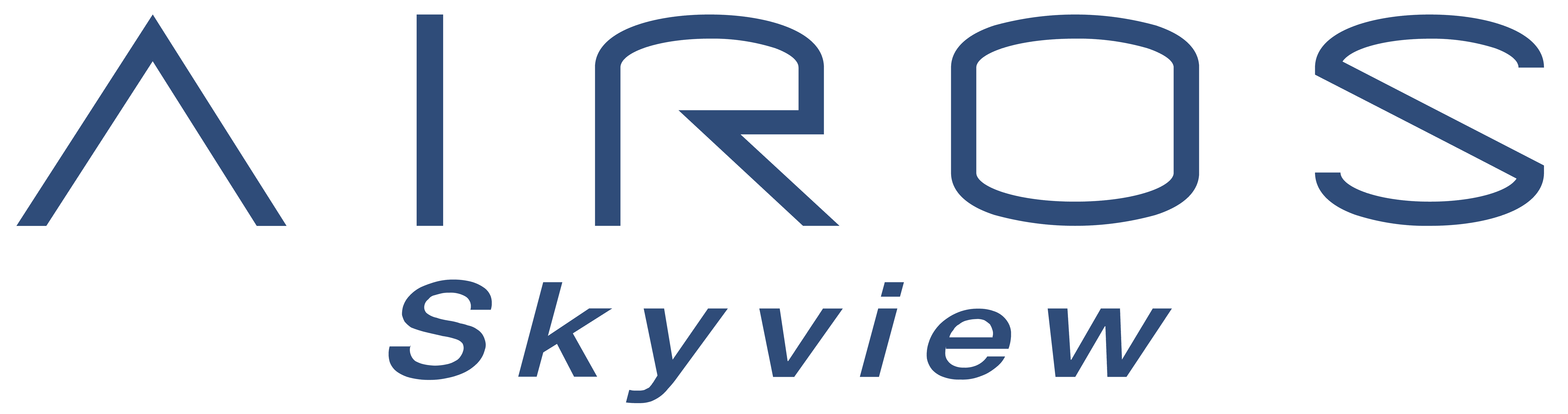
I created a more meaningful logo that reflects Skyview’s vision, along with a color scheme that represents the brand and resonates more strongly with customers using the service.

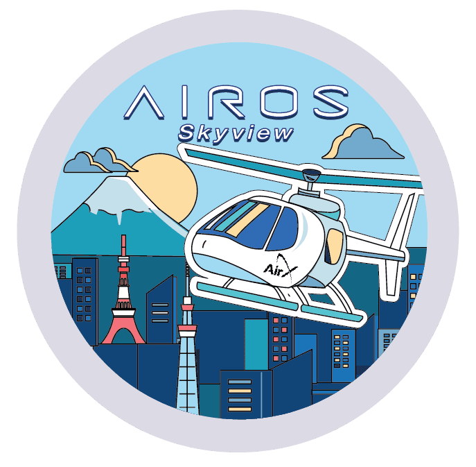
New Logo Concept
Sky / Cloud
“Sky” evokes the clouds and airiness of flying, reinforced by an eye icon. Together, the logo intuitively communicates Skyview’s new aerial experience.
View / Eye
“View” represents sight and perspective.
An eye icon is incorporated into the logo to highlight the unique viewpoints and panoramic scenes visible from a helicopter.


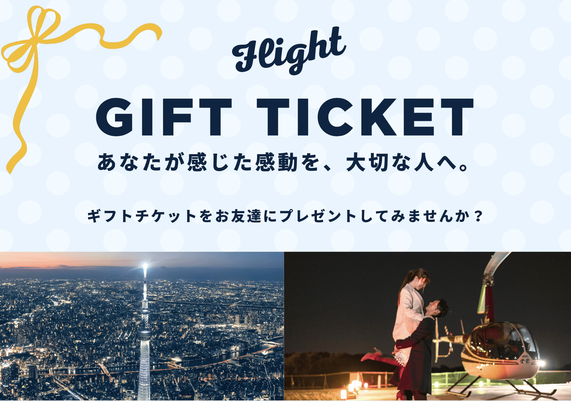
Promotional Design
I also designed a promotional pamphlet using the new branding to showcase Skyview’s updated concept and logo.

Social Media & Campaign Lead
I led the creative direction and execution of social-first campaigns, producing banners, short-form video content, and multi-format digital assets.
Each visual was developed with a strong focus on target audience behavior, brand consistency, and platform-specific best practices.
Working closely with the marketing team, I analyzed CTR and CVR data to refine creative outputs — balancing storytelling with measurable performance impact.